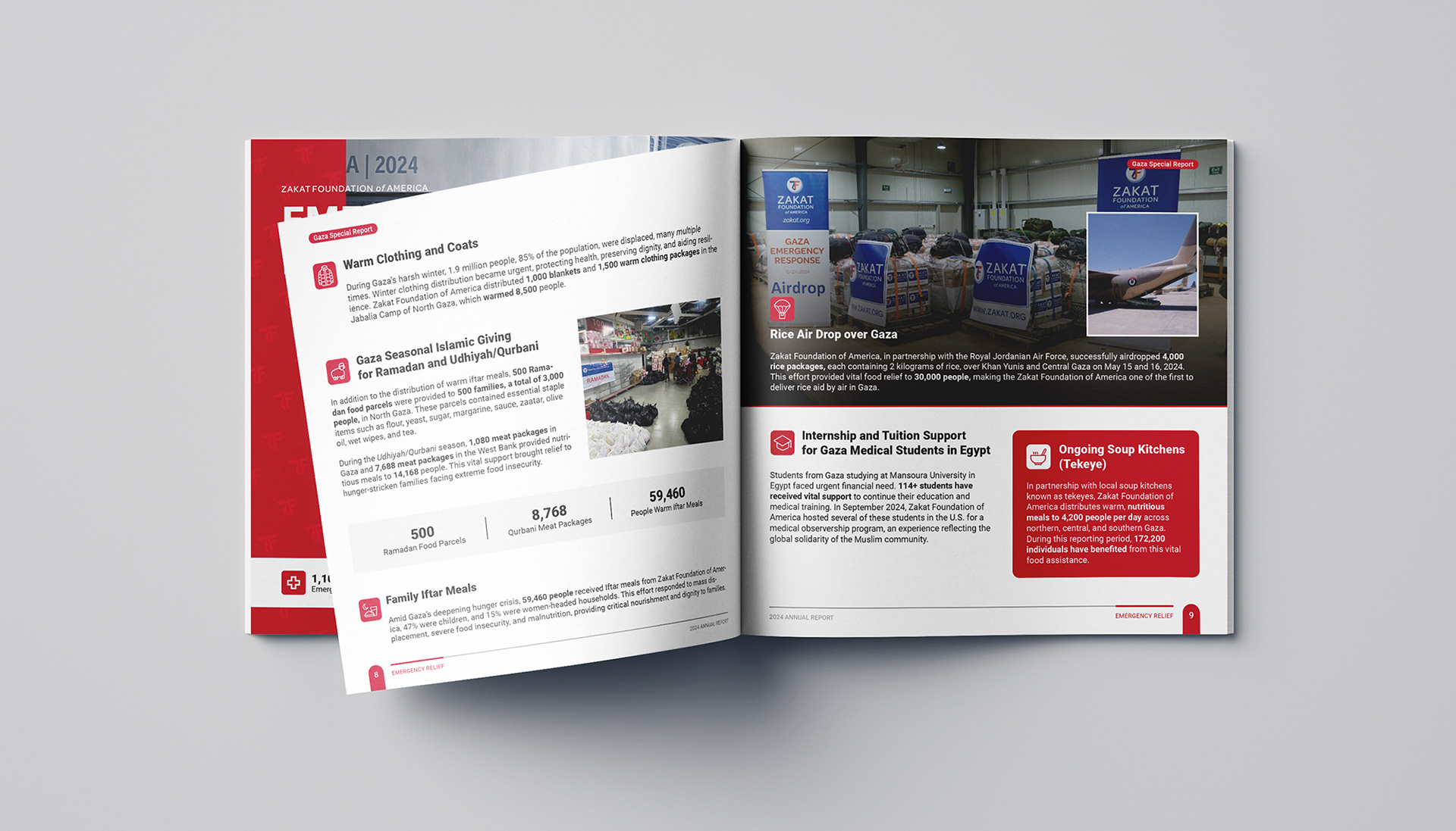
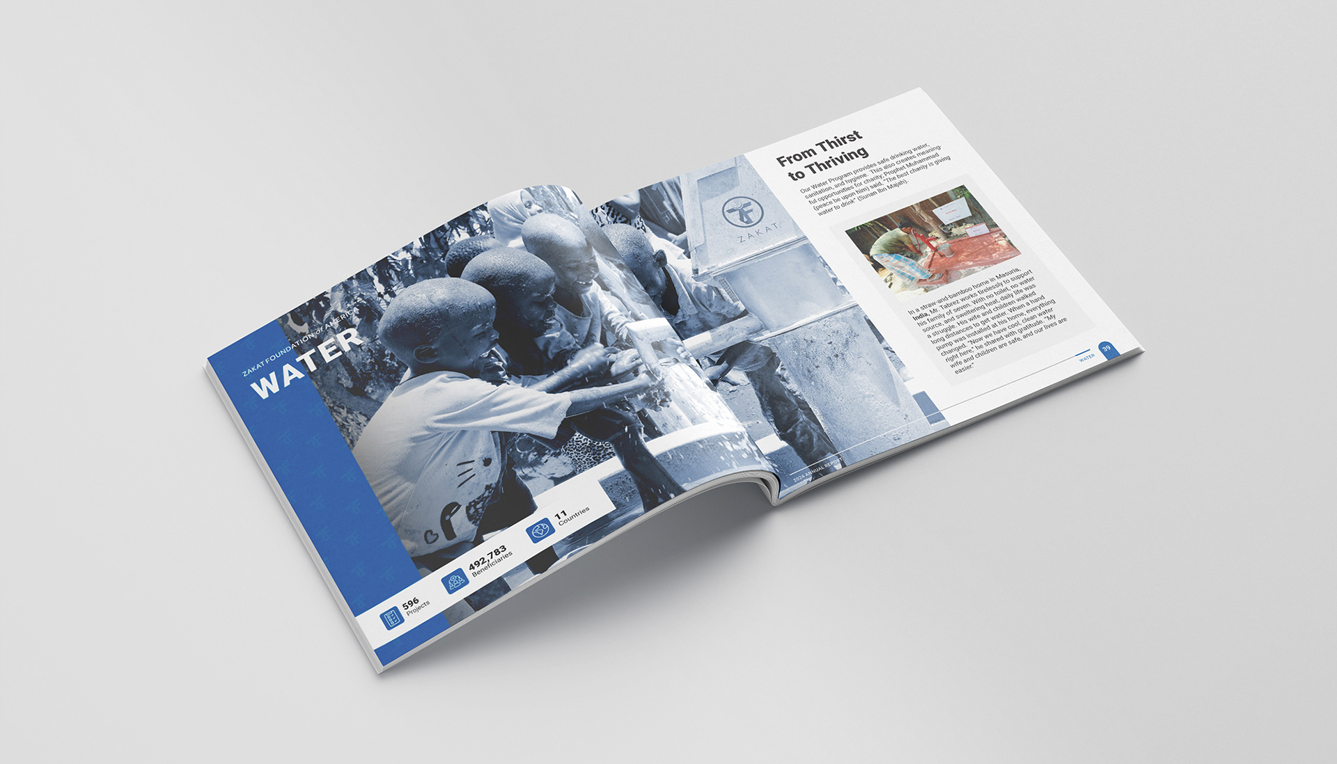
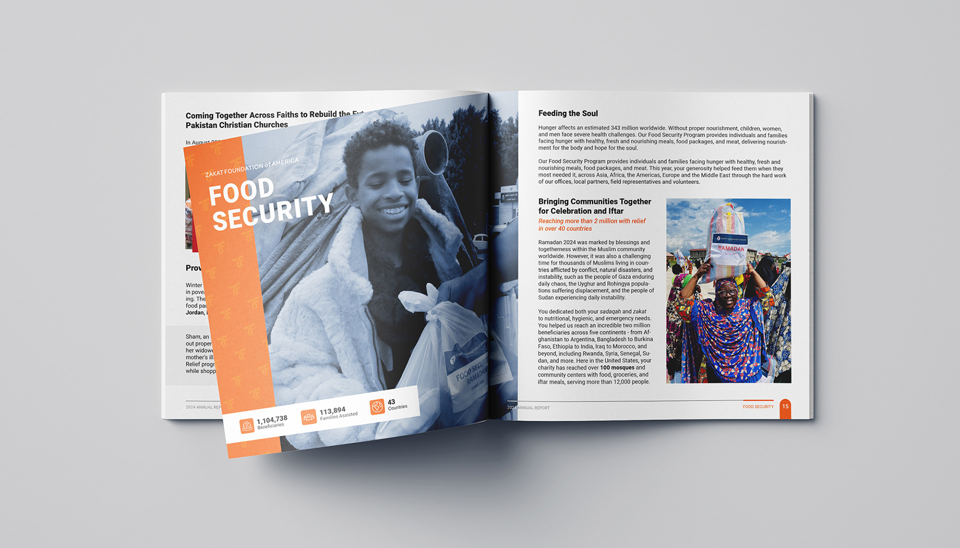
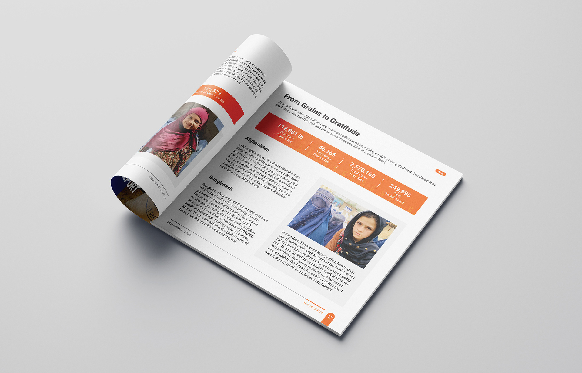
This annual report was designed in line with the organization's visual identity, while introducing a more modern and reader-friendly approach compared to previous years.
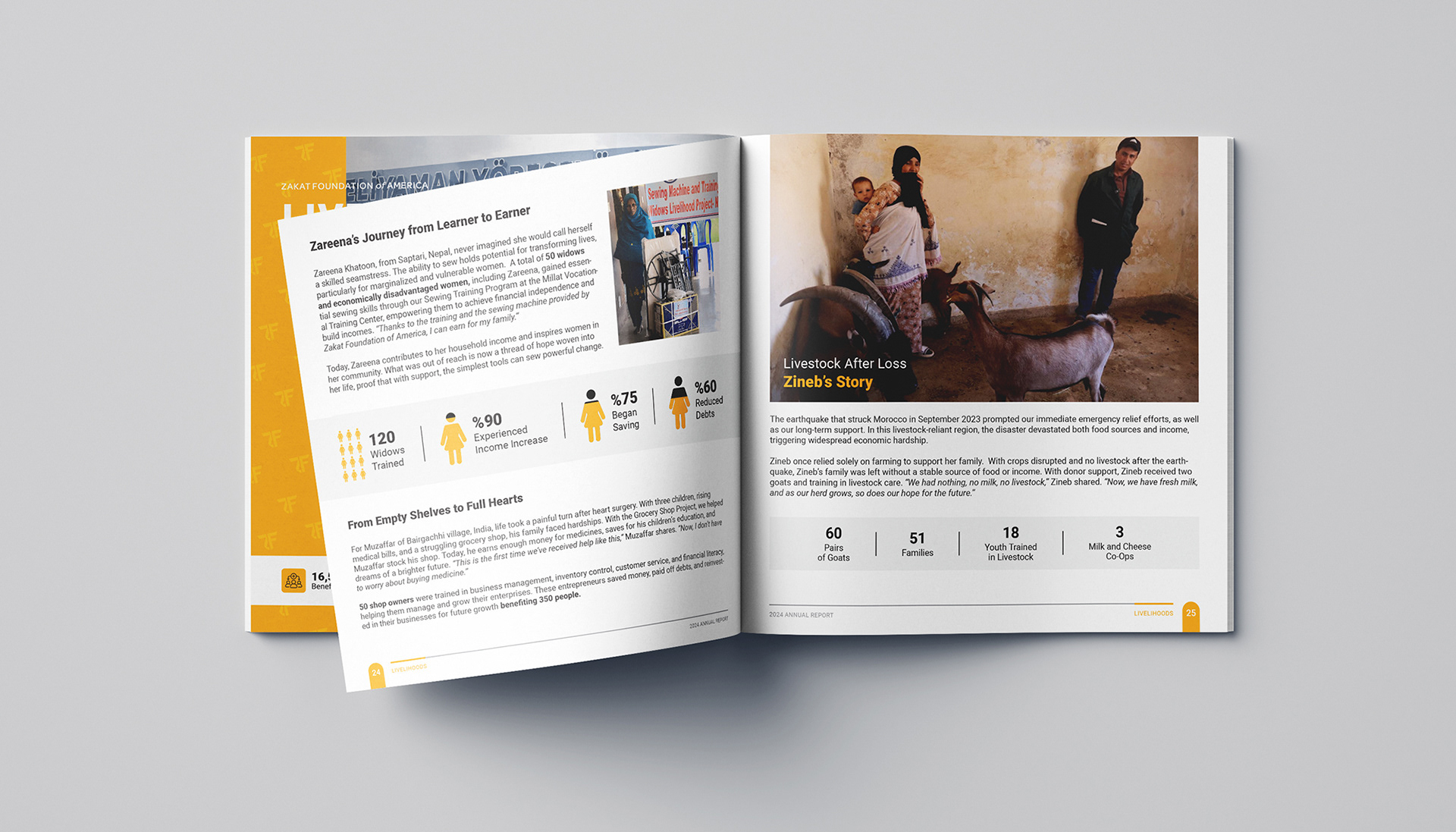
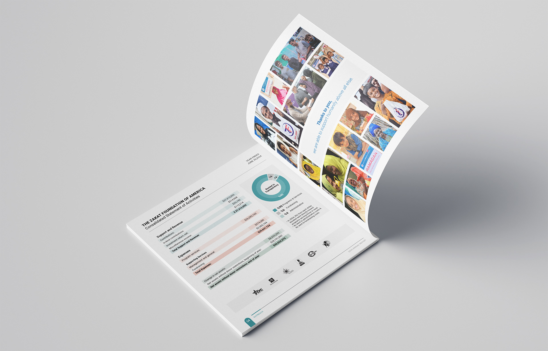
To ensure clarity despite the text-heavy structure, a clean layout system was developed. Each section was separated by a unique color-coded theme, helping readers easily distinguish between categories such as Food Security, Water, Emergency Relief, and more.
Custom-designed icons and carefully selected colors enhance navigation and prevent visual clutter.
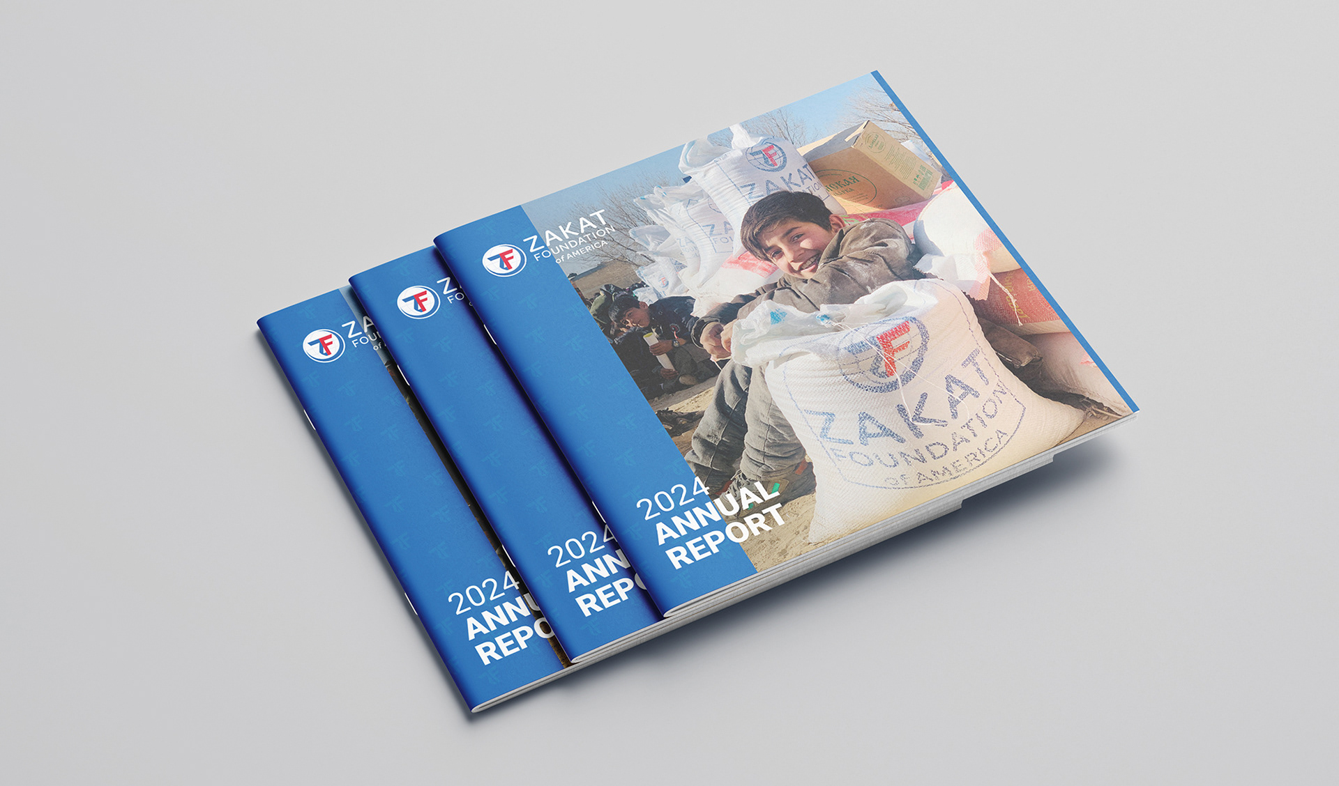
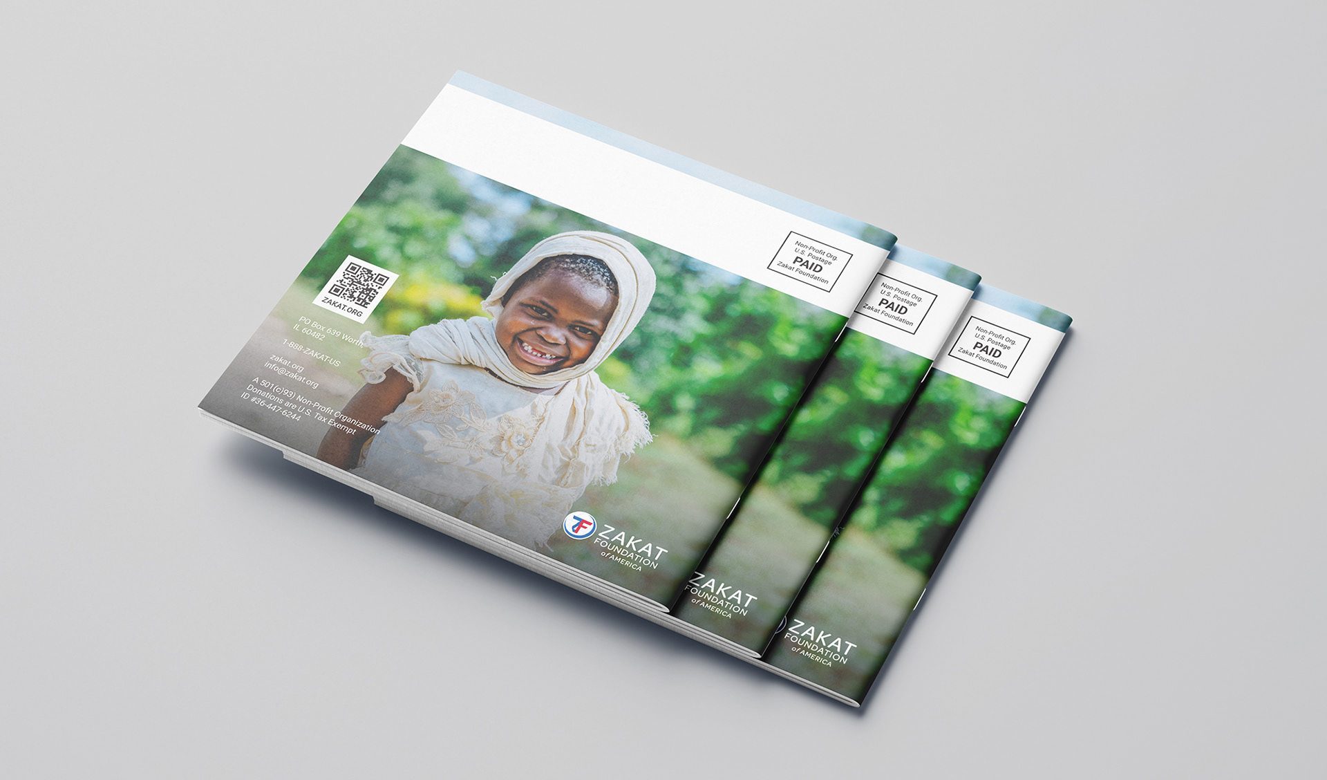
Special attention was given to the front cover, back cover, and chapter separator pages. These were designed to be visually impactful, aligning with the emotional tone of the photography while maintaining brand consistency. This project demonstrates my ability to balance structure and creativity within strict institutional guidelines, delivering a final product that is both informative and aesthetically refined.